The Ultimate Guide to Perspective: Definition, Types, Rules, and History
Perspective has not always been known to artists. The word perspective derives from the Latin word "perspicere," meaning “to see through.” It is the art of representing three-dimensional objects or spaces on a two-dimensional surface through a set of very specific rules.
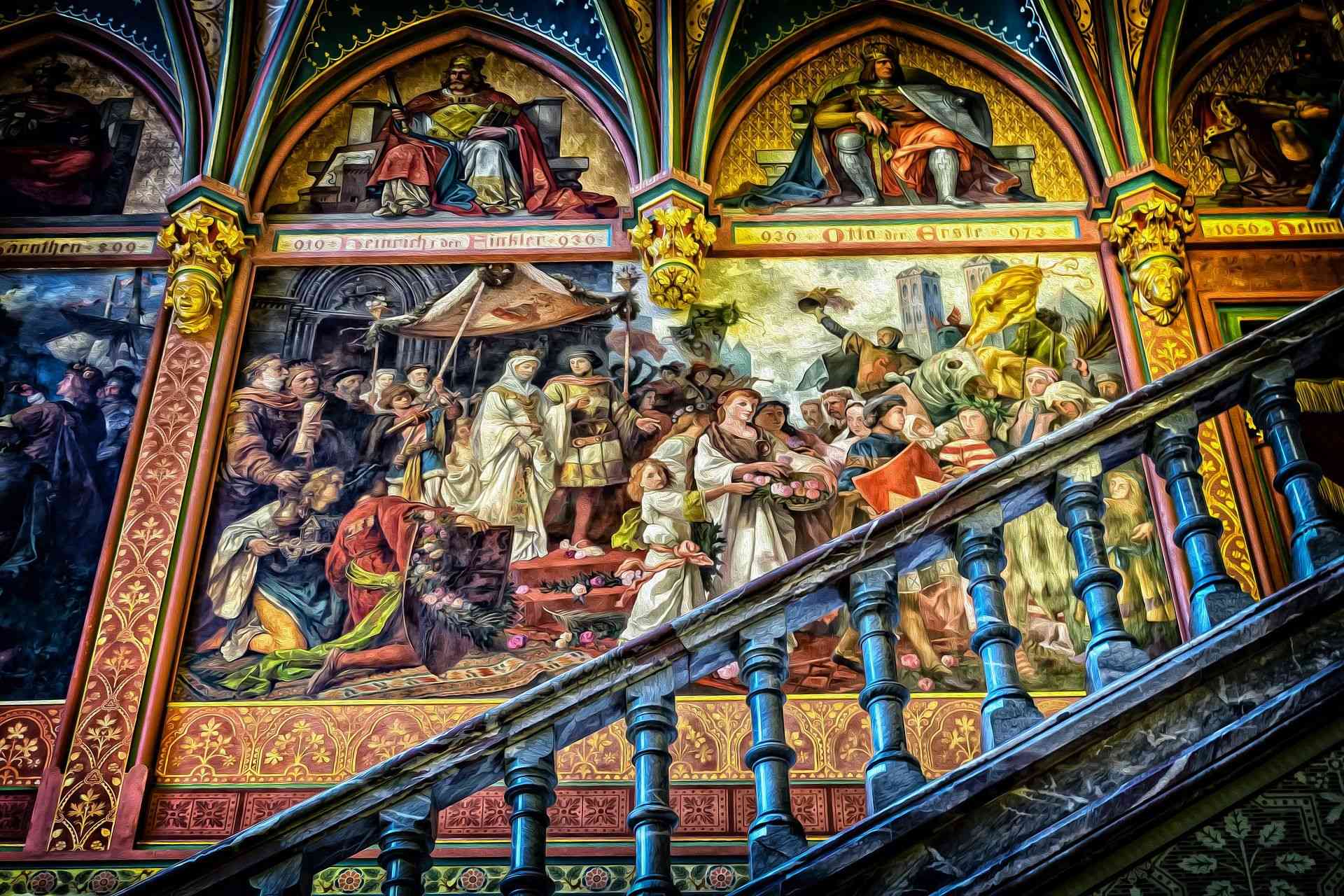
Contrary to what one might think, perspective, or at least its exact laws, has not always been known to artists: it is not a natural, assimilated notion. With the evolution of techniques, the discovery of certain inventions, it became better and better, but many artists still today do not stick to it.
Are you excited already to dive right into the realms of perspective and discover what it is all about? Let’s start by the basics then, and discover the meaning behind the intriguing word “Perspective.”
What is perspective?
The word perspective derives from the Latin word "perspicere," meaning “to see through.”
It is the art of representing three-dimensional objects or spaces on a two-dimensional surface through a set of very specific rules. Its purpose is to recreate the optical illusion of space and volume by representing them as we see them by looking at them from a particular point.
When you draw in perspective, the more distant the objects are in space, the smaller they appear. In perspective, the lines which are parallel in reality converge towards a vanishing point on the drawing.
Types of perspectives:
There are many types of perspectives, some more complicated or realistic than others. Here are some examples:
The cavalier perspective:
Mainly used in technical drawing and architecture, it allows us to represent objects in 3D. This representation has no vanishing point: the size of objects does not decrease when they move away. This perspective does not pretend to give the illusion of what can be seen, but simply to provide information on the notion of depth.
Simple to carry out, it is a naive perspective that can translate a lack of "vision in space." Often used in freehand drawings, it is nevertheless to be discouraged by its ambiguity of representation: an object distant from another may seem to be somewhat above or below.
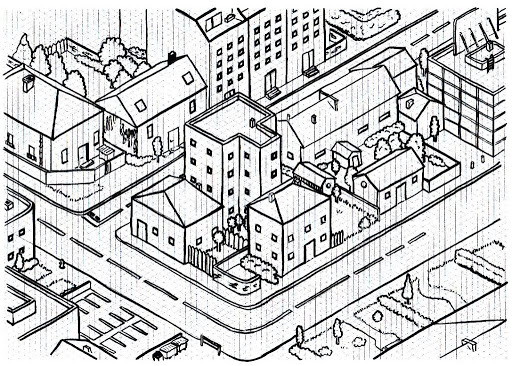
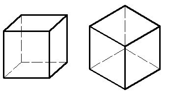
A simple checkered sheet allows you to make drawings in perspective, using the vertical, horizontal, and diagonal lines of the grid. We can realize 2 types of views, one frontal with the object in front of us, and the other axonometric with the object seen on edge, as in the drawings below.
The linear perspective
The linear (or conical) perspective has remained the dominant perspective in the artistic field because it best imitates photography, and what the eye sees. It is organized from the viewer's eye.
Want to learn about the Romanesque and the Gothic architectural styles? Click below:
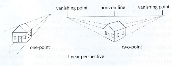
It is a projection, on a plane (a table) of all the lines passing through the sides of an object towards a point: the eye or the point of view. The eye contemplates objects on a surface where the illusion of depth is given by decreasing the size of objects according to their depth. In addition, the lines leaving the object converge at a vanishing point, and if there are several, they are all on the same line called the vanishing line or horizon line.
That is to say that this perspective consists in constructing convergent lines at a vanishing point, these lines are in reality parallel, but if we observe them from a distance, we see that they converge at a point. This allows the reduction of the most distant forms. (this corresponds to what our brain expects).
Here we can also realize 2 types of views, one frontal with the object in front of us (1 vanishing point) and the other axonometric with the object seen on the edge (2 vanishing points).
It is called a linear perspective by Leonardo da Vinci because it only uses lines. It is also called a conical perspective because the straight lines connecting the observer's eye to the outline of the object form a cone.
The atmospheric perspective
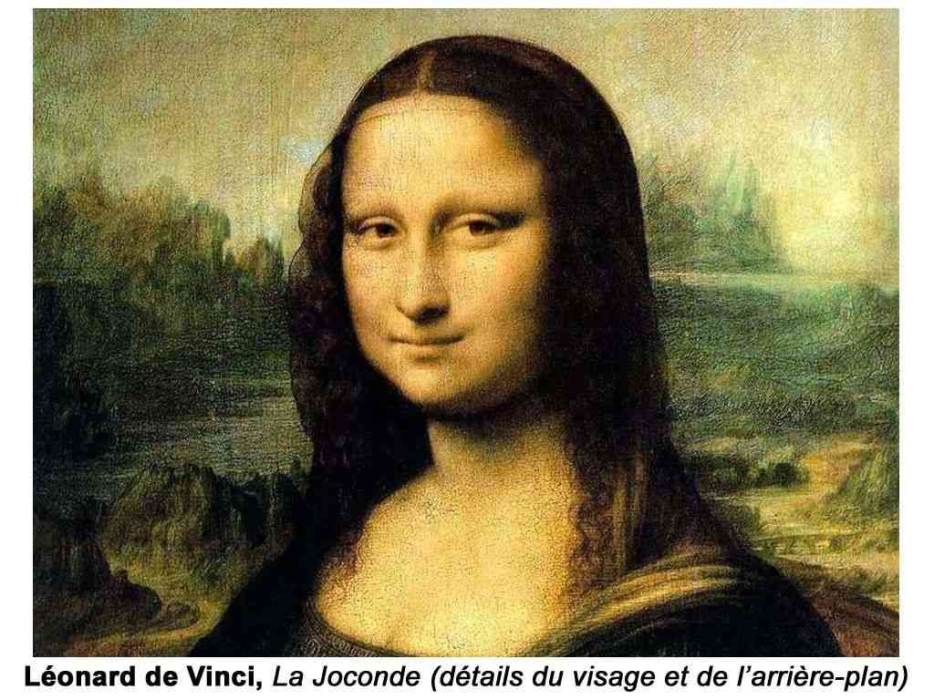
This form of representation in perspective by details and contours can be compared to the depth of field in photography: the image is sharp in the foreground and becomes "fuzzy and light" towards the back.
In the drawing, all the objects in the foreground must, therefore, be represented in a precise manner. Then, the details will be less and less precise as we draw the parts located backward. We must also play on the contrast between light and shadow. Indeed, the contrast must be pronounced in the foreground: black and white contrast, and less sustained in the rear planes: dark gray and light gray contrast.
Want more similar stories in future? Consider supporting the author by donating here
With colors, when you observe a mountainous landscape, you will notice in the succession of wooded valleys, a modification of colors for an identical object, here the fir tree. Your vision, therefore your brain, will register for the foreground fir trees a deep green, preferably dark. Green fades to become light blue in the distance. This phenomenon is generated because light and colors pass through the atmosphere (the air) charged with impurities: various pollutions, humidity, etc. This pollution slows the propagation of colors, more or less depending on the wavelength of the color, each color having its own wavelength. Thus, identical colors no longer reach our gaze with the same intensity.
Identical colors will be warmer in the foreground than those in the background: deep colors in the foreground, but washed out and lighter and lighter as they progress towards the background.

Some important Renaissance works that use perspective (and sketches highlighting this use).

History:
Contrary to what one might think, perspective, or at least its exact laws, has not always been known to artists. It is not a natural, assimilated notion. With the evolution of techniques, the discovery of certain inventions, it became better and better, but many artists still today do not stick to it.
In Egyptian Antiquity (4000 to 500 BC), artists ignored perspective. The characters were represented in profile, without depth. Their size in the image depended on the importance they had, for example, a pharaoh was depicted larger than his servant.
We find this same principle in the Middle Ages, the more important characters are larger, and the sets are not proportioned according to the size of the characters. Most of the time-space is folded down on one plane, there is no background. It is said to be a symbolic space because it does not aim to faithfully represent the real world. These are often paintings depicting gods or saints, or pharaohs who are considered gods.
It was in Greece from 500 BC to 100 BC then in ancient Rome that philosophers and mathematicians began to understand the principles of perspective, but it really did not develop until the Renaissance in the fifteenth century in particular.

The Renaissance is a period that ran from the beginning of the 15th century until the 16th century. It was a period of great artistic and scientific development, especially in Italy, at the start and then gradually throughout Europe. It is the beginning of humanism, which considers that man has an important place in the universe. We are rediscovering Greek and Roman culture.
Science also makes many advances. It’s an era of great discoveries. We realize that the earth is no longer flat, we are exploring new continents.
Artists and scientists like Filippo Brunelleschi, Léon Battista, Alberti, and Léonardo da Vinci looked for scientific, geometric, and sure methods to represent the world as we see it with its volume and its depth.
Planning for your next vacation in Europe? We have you covered

From this time, the perspective will be taught and used as the primary means of representing the real world. In the 19th century, the invention of photography, which promoted the dissemination of images, allowed everyone to see and understand perspective definitively.
In the twentieth century, artists, according to their sensitivity, represent reality more freely than before, this is the end of academicism. Artists are turning away from the rules and principles taught in schools (academies). Some use perspective to distort it, exaggerate it, or use it in a roundabout way, others refuse it completely.
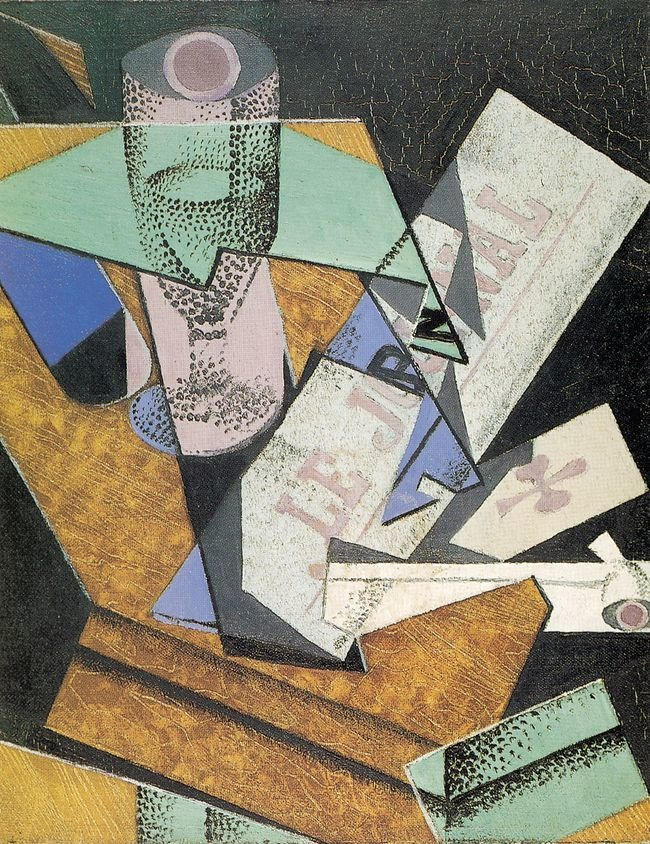
In this painting, for example, the cubist painter Juan Gris disperses the perspective so that the objects are observed from multiple points of view.
The perspective developed during the Renaissance is called linear and is based on several principles:
A vanishing point is placed on an imaginary line, which corresponds to the height of the gaze and which is called the horizon line. All the lines which go towards the distance go towards this vanishing point which gives an effect of narrowing of the forms. They are called receding lines. On the other hand, the horizontals always remain horizontal, and the verticals always remain vertical.
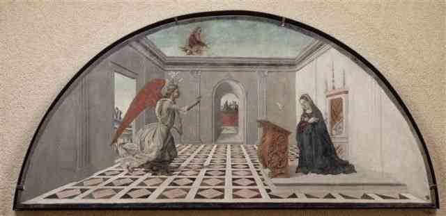
From two vanishing points, it is said to be conical (because the lines that meet form a cone). This is a perspective that already seems more natural.
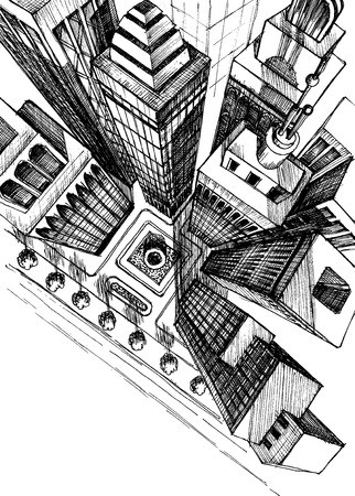
We can further complicate things by putting a third point at the bottom (aerial perspective), but there, it becomes very complicated.
In Asia, we instead use the parallel perspective, which consists of using oblique and parallel lines to create depth; it is this same type of perspective that we already used intuitively in Antiquity and which is currently used for the technical drawing. It can be cavalier or axonometric.
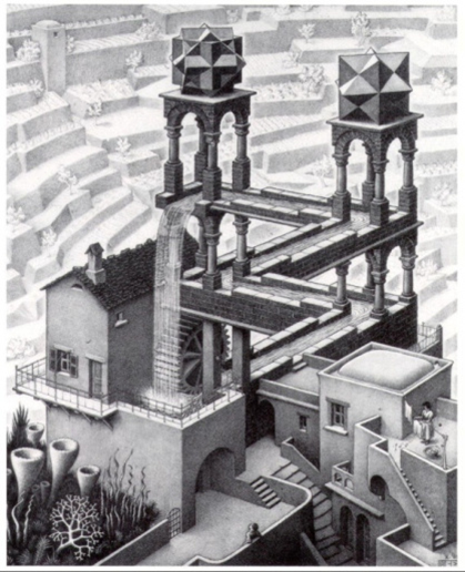
Finally, the atmospheric perspective consists in making more blurry and attenuating the colors in the distance to create the impression of distance:

In a perspective space, there are often several planes, the elements are represented smaller and smaller towards the background, and they can overlap to give the impression that they are in front of each other and that several planes follow one another between the foreground and the background of the painting. Elements, objects, and colors are represented realistically with volume and shadows.
And finally, an image that I like:
Recommended reading just for you:


